Branding elevator complex “Dionis”
The Dionis grain elevator complex operates in an industry where branding has traditionally remained quite conservative. Most companies use similar visual designs and symbols, which is why brands often look the same.
The company decided to begin the rebranding process with a redesign of its brand and visual identity in order to more accurately highlight its area of business, retain a recognizable name, and at the same time make the brand more modern, accessible, and visible to its target audience.
Meaning: A brand symbol should stem from the essence of the business and be understandable to its audience.
Mission
Develop a new brand identity for the grain elevator complex that:
- retains the recognizable brand name but has a more modern look
- sets the brand apart from competitors in the agricultural sector
The key challenge was to give the brand new meaning without losing its connection to the company’s actual business and infrastructure.
Decision
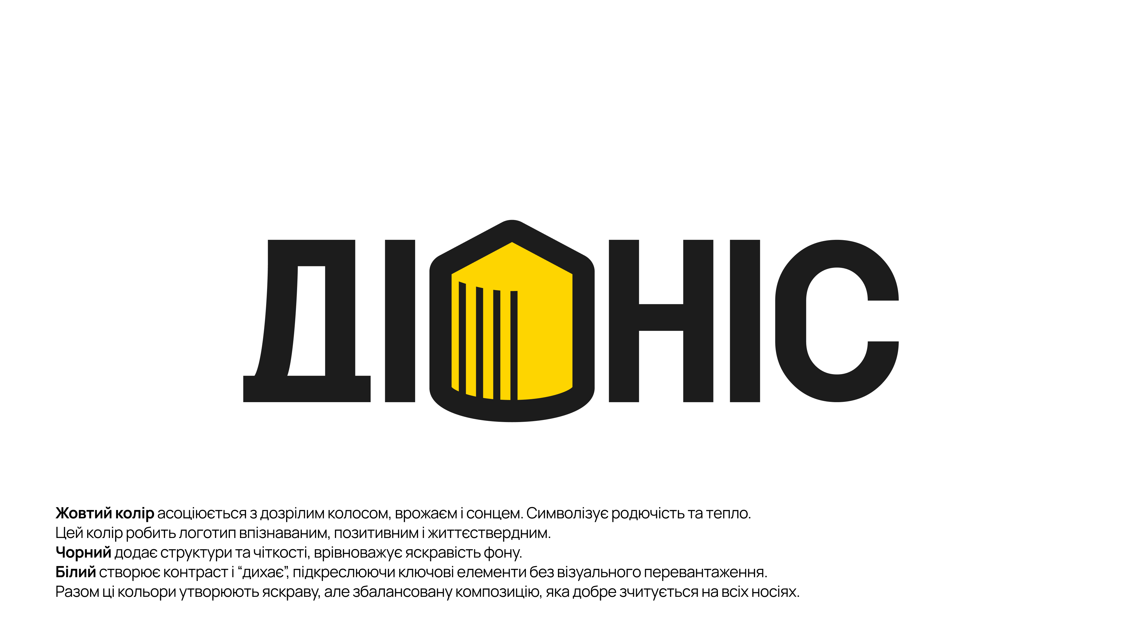
We created the logo and visual identity based on the company’s key symbol - the silhouette of a grain elevator.
Plant imagery is commonly used in branding for the agricultural sector. We took a different approach and chose the most recognizable element of the business as our foundation: the silo at the grain elevator.
This image became the central element of the logo. The icon was integrated directly into the name. A custom typeface was also created specifically for the brand: its shape echoes the silhouette of the grain elevator and reinforces the connection between the brand identity and the actual infrastructure object.
Visual system
To make the brand stand out from the competition, we moved away from the traditional green-and-brown color scheme.
The striking combination of yellow and black creates a strong and recognizable image:
- Yellow symbolizes the sun and wheat ears
- Black symbolizes black soil and technological advancement
This combination allows the brand to maintain its connection to nature while still looking modern and distinctive.
Services
Brand and Market Analysis | Branding for Agricultural Companies | Brand Concept Development | Logo Design | Graphic Symbol Development | Custom Typography | Visual Identity | Brand Color System | Graphic Element Design | Adapting the Visual Identity to Various Media | Design of Print Advertising materials
Result
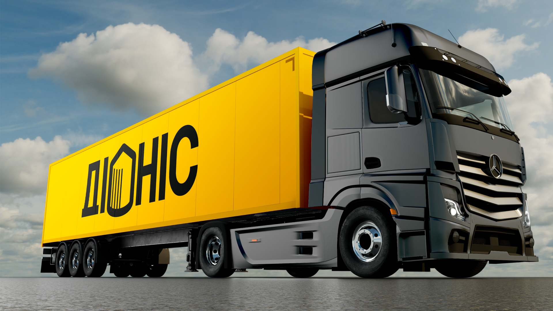
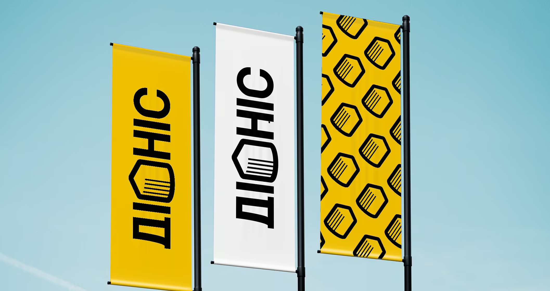
As a result, the company has developed a modern and recognizable brand identity. The brand identity is easily scalable, from corporate documents to the facades of the elevator complex.
The visual identity helps the brand project a modern and confident image in the competitive agricultural market.
This case demonstrates how well-thought-out branding can enhance the perception of agribusiness and give familiar infrastructure elements new meaning.
.avif)

