Branding for the IT company NOI
Industry: IT, systems integrator
Client: NOI
Scope of work: brand strategy | naming and tagline | logo | visual identity | brand book | website | communications materials
Duration: 10 months
Market: Ukraine, B2B
Meaning: More than just IT.
Project
NOI is a systems integrator that helps businesses consolidate complex IT systems into a single infrastructure. To enter the market, the company needed a brand that clearly conveyed it's role as a technology partner for businesses.
We built the brand on the idea of “more than just IT.”
The g.agency team developed the company’s brand from scratch - from positioning and naming to the logo, visual identity, and key communication materials. The goal was to create a modern, tech-forward image and differentiate the company among system integrators in a competitive market.
Market context
The system integration market is quite saturated. There are many companies operating in this field with similar specializations, and most of them use similar approaches to positioning and visual communication.
As a result, system integrators are often viewed as providers of standard IT support. In reality, their role is much broader: they analyze business processes, integrate various technological solutions, and ensure the stable operation of companies’ IT infrastructure.
That's why the NOI brand needed to show a different side of a systems integrator - a strategic partner that helps businesses build effective technology systems.
Mission
Create an IT company brand that:
- establishes a clear positioning for the systems integrator
- brings together the company’s different areas of activity
- creates a modern technological image
- is adaptable to various communication formats
Branding
The brand is built on the idea of “more than just IT.”
The company positions itself not as a technology provider, but as a partner that helps businesses build a stable IT infrastructure and make technology-related decisions.
This positioning became the foundation for the brand's future development.
Naming and slogan
We created the name NOI, which stands for Not Only IT.
The name works on two levels: as an abbreviation that directly conveys the brand’s concept, and as an association with the figure of Noah - a symbol of reliability, preservation, and a strong foundation.
To reinforce our positioning, we created the slogan: Delivering solutions. Not just IT.
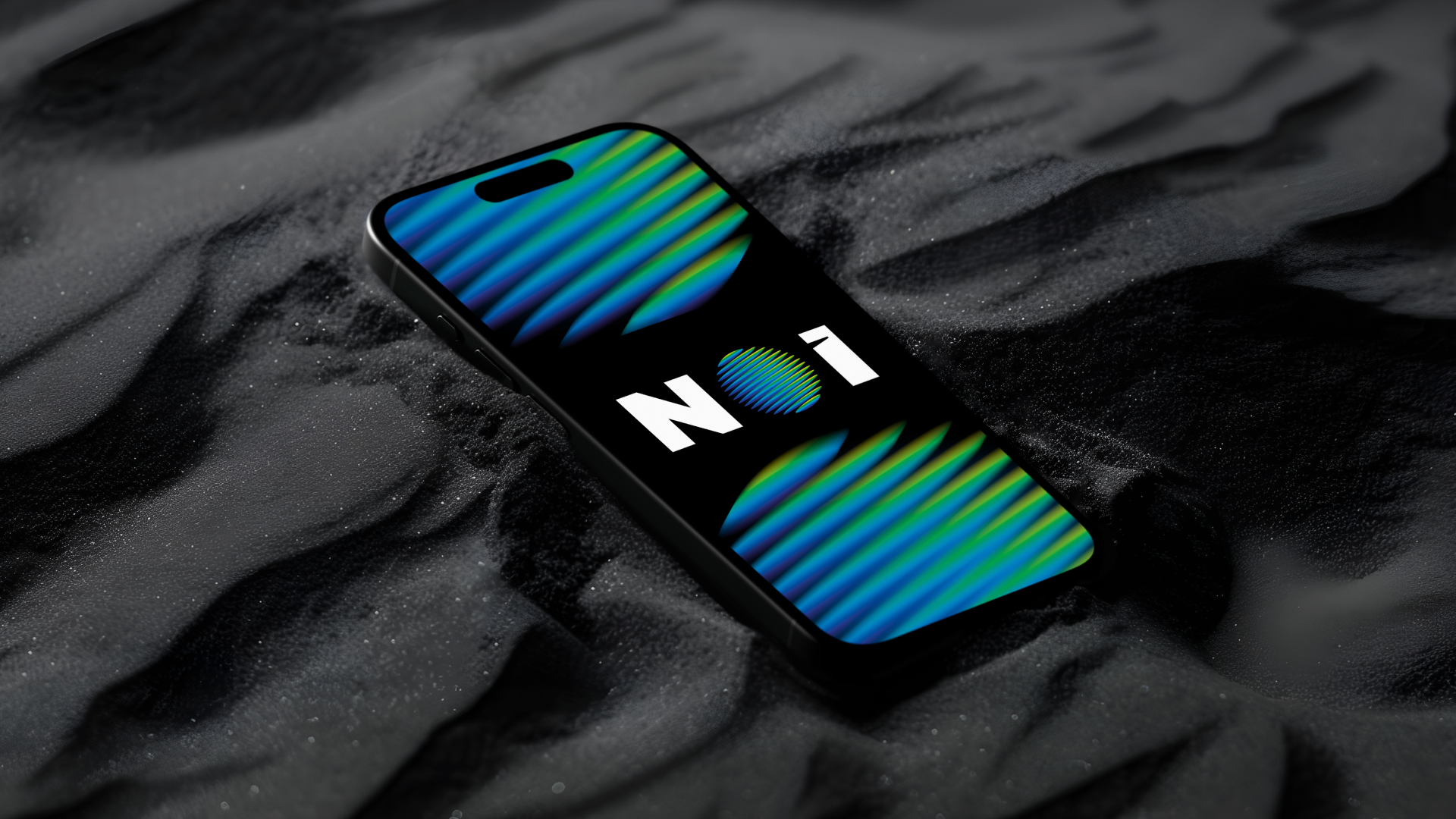
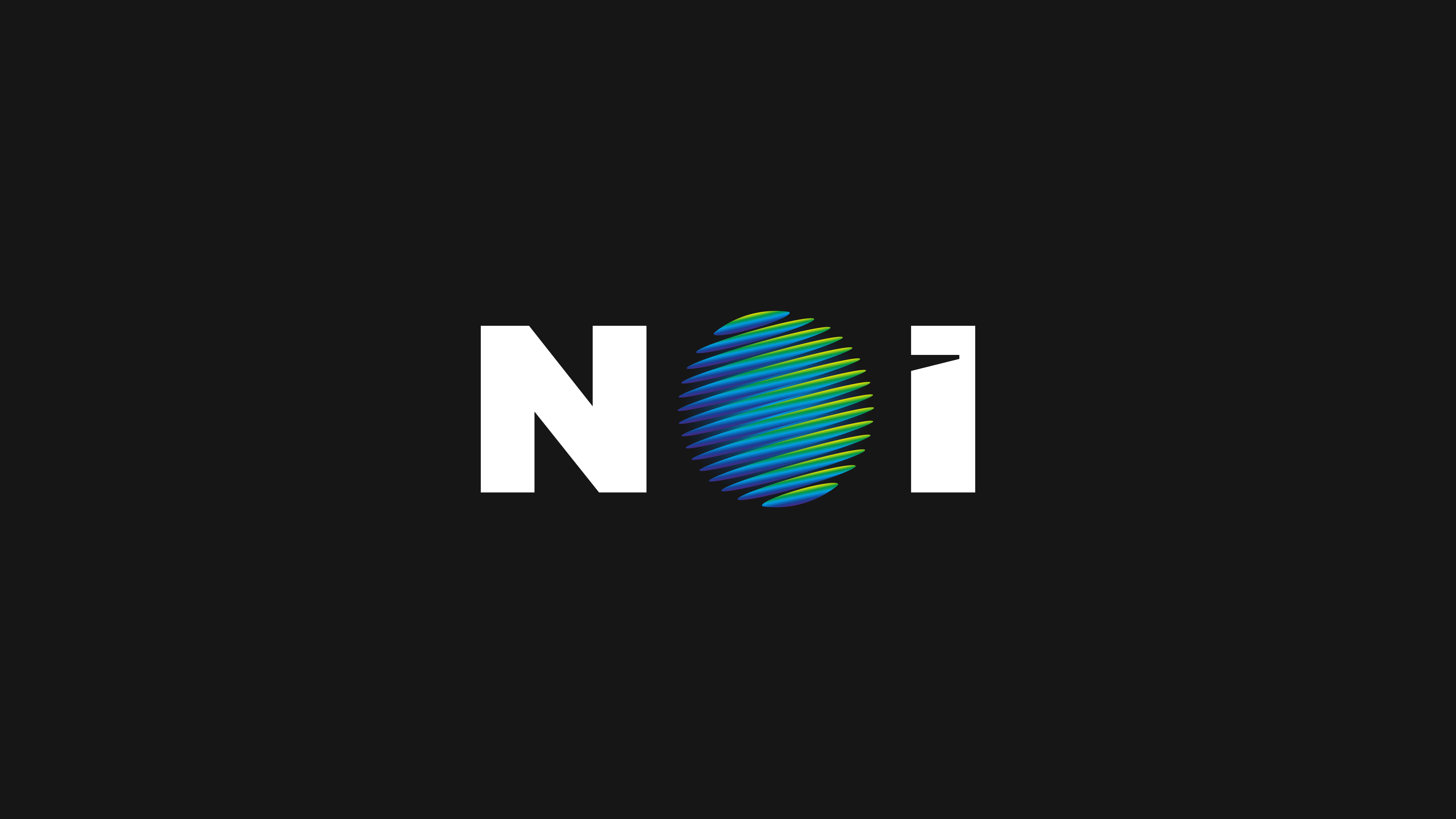
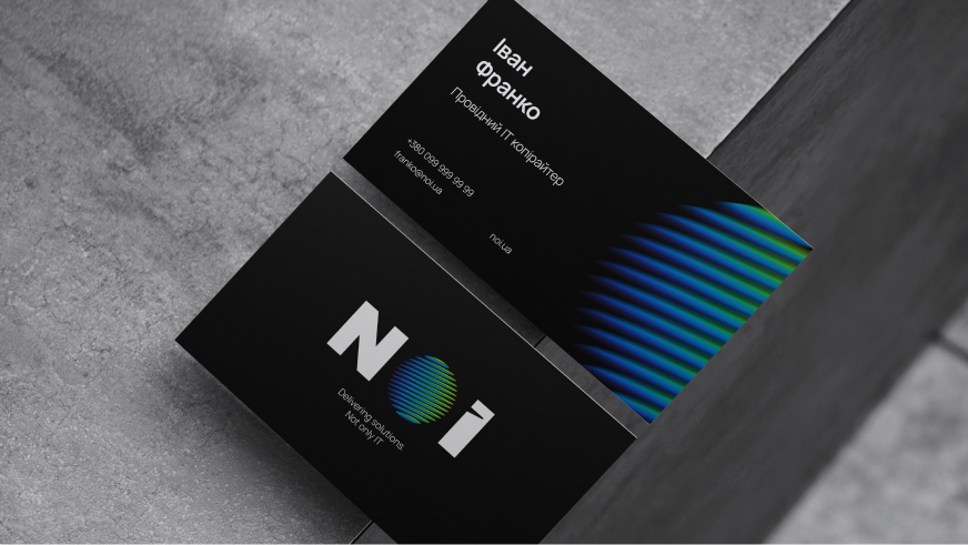
Logo
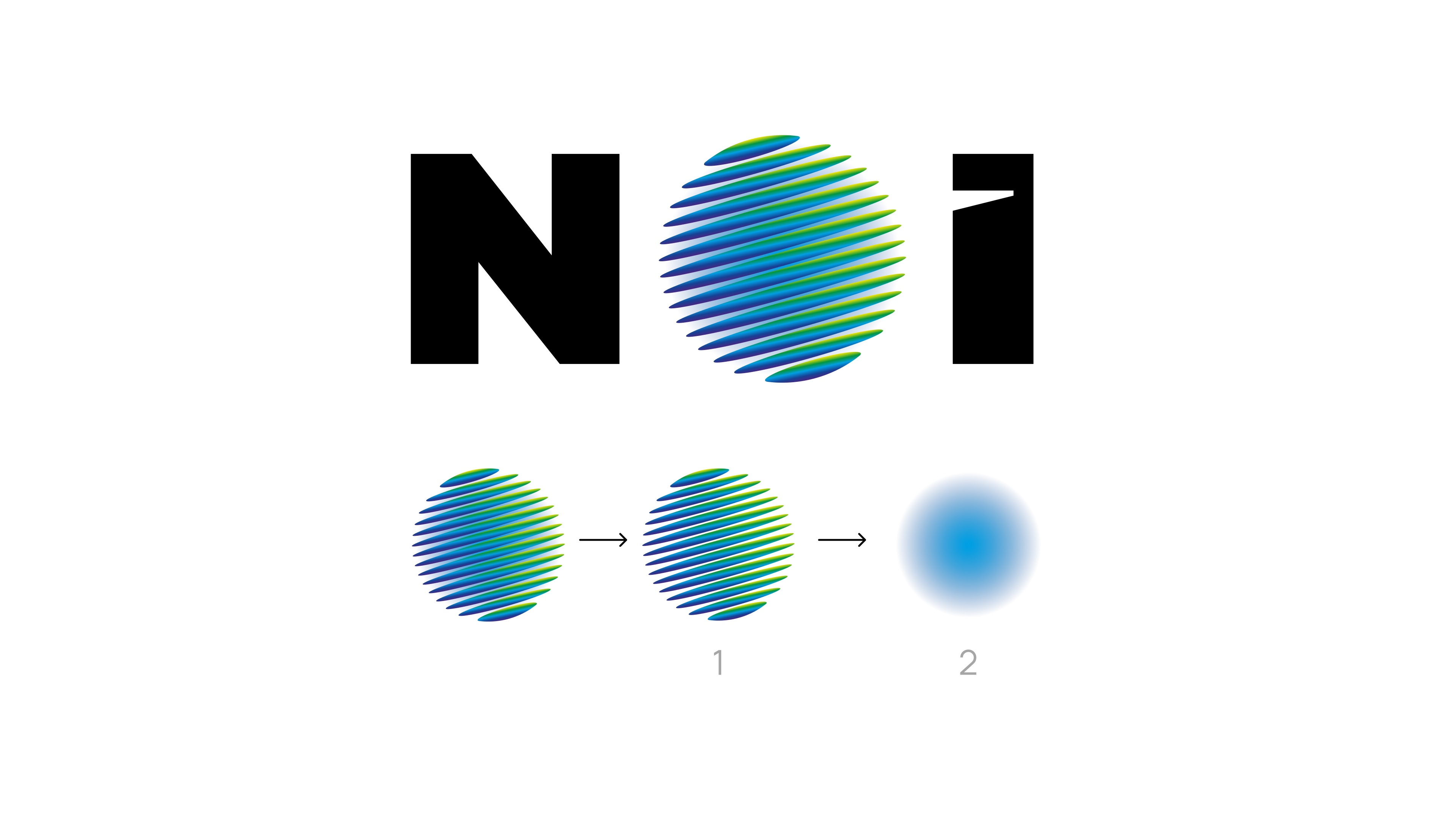
In the logo, the letter O turns into an icon shaped like a planet.
The dynamic lines with a neon effect give the logo a sense of depth and a futuristic feel. At the same time, the logo remains highly readable even in monochrome.
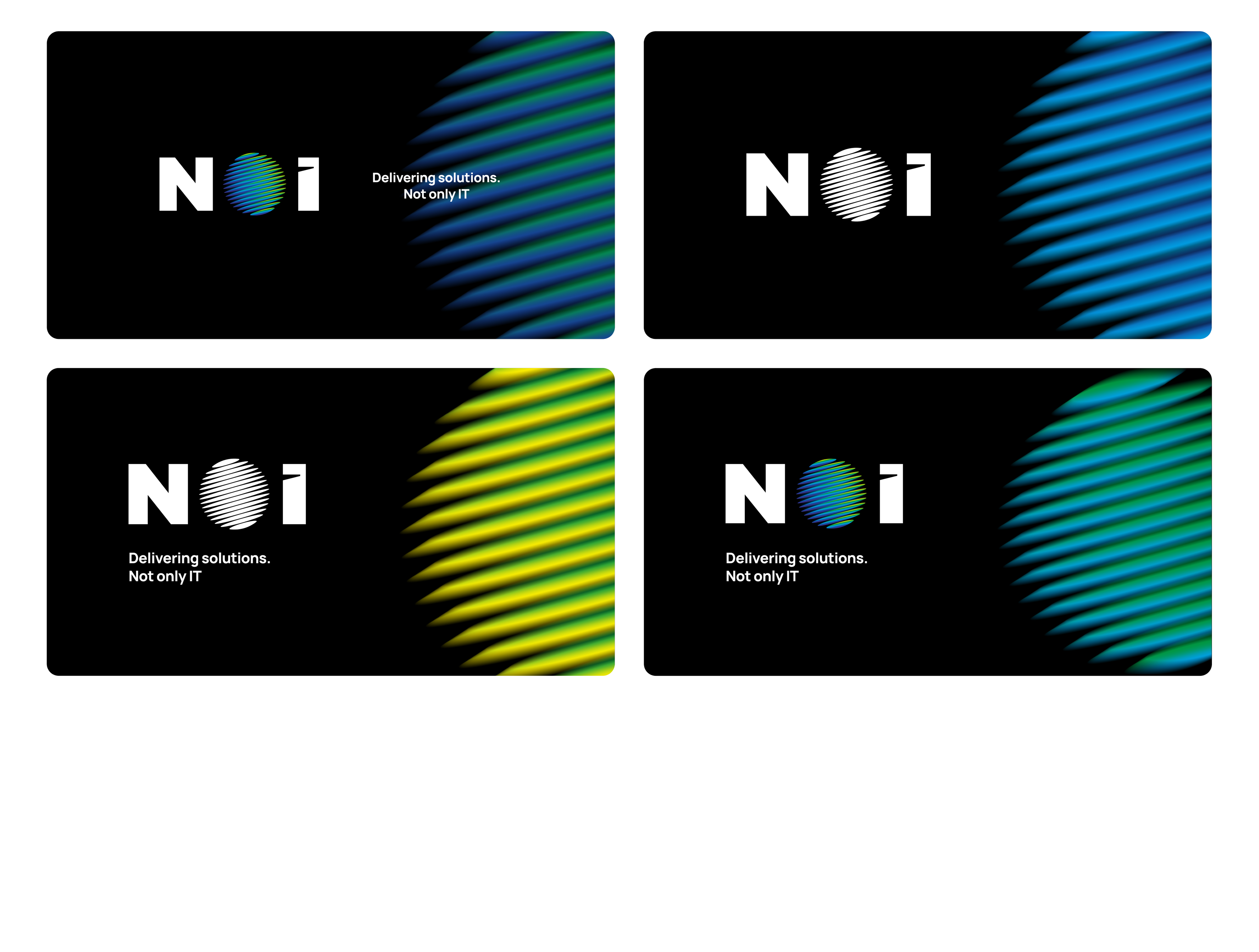
Visual identity
Based on the icon, we created a system of graphic elements that convey a sense of motion.
It allows adapt the brand identity to various communication formats.
The futuristic color palette is complemented by gradients that highlight the diversity of the company's technological areas.
((images1))
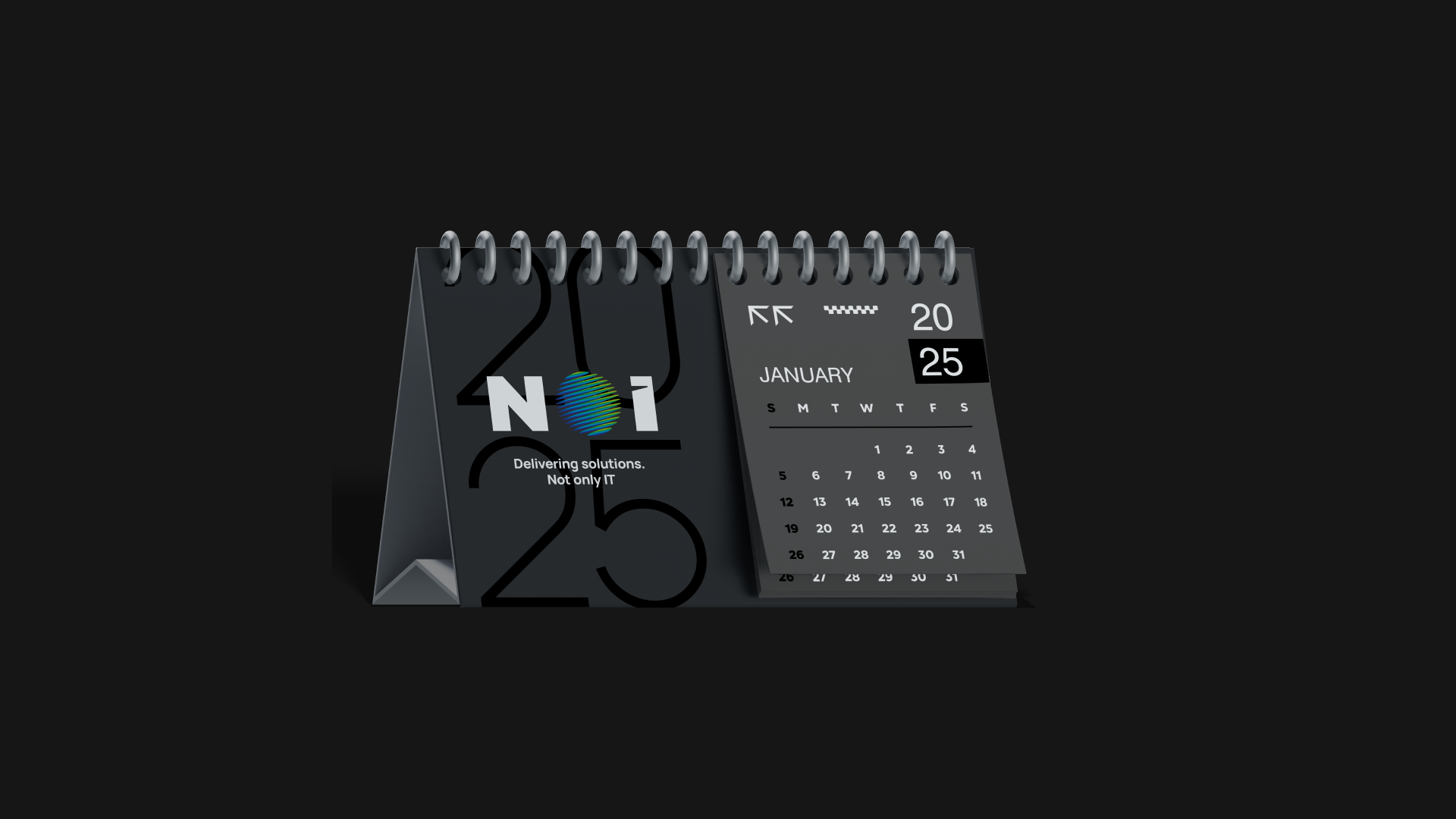
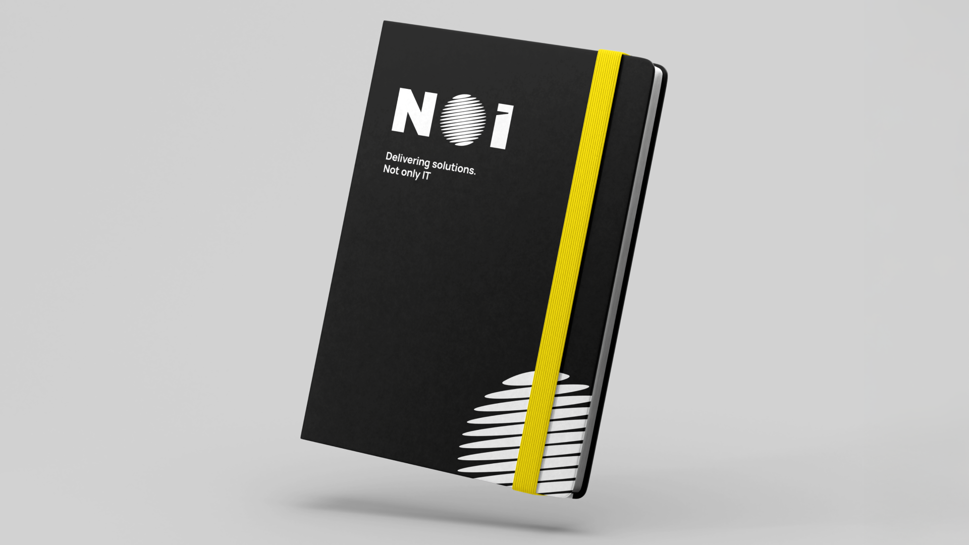
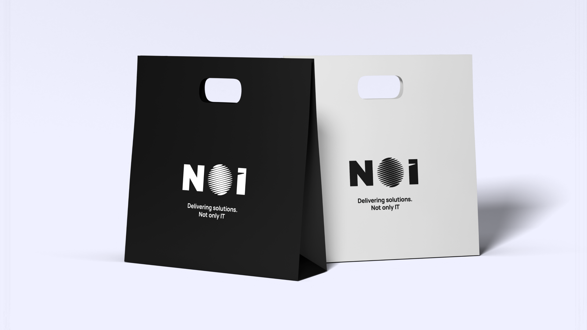
Communication materials
Based on the new brand identity, we created designs for the brand’s key materials:
- business cards and other printed materials
- corporate presentations for clients
- merchant design
These tools help the company consistently present its solutions when interacting with customers.
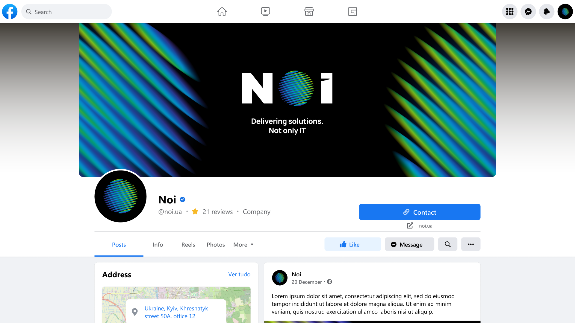
Website
The creation of the website was a separate phase. It's structure and visual language convey the brand's technological character and help the company clearly present their business solutions.
Result
As a result, the g.agency team created a comprehensive brand for the IT company, which helped NOI confidently enter the Ukrainian systems integration market.
The company achieved:
- a clear positioning in the competitive IT market
- a recognizable brand that stands out from typical competitors
- a flexible brand identity system for various communication channels
- a unified visual language for presenting technological solutions to clients