Branding for the Tilo Massage Studio
Industry: Beauty & Wellness
Client: Tilo Massage Studio
Scope of work: brand strategy | naming | logo | visual identity | social media strategy | post design | copywriting | Instagram management
Market: Ukraine, local business
Meaning: Bodywork begins with being aware of yourself.
Project
Beauty businesses in residential complexes often look the same. Most salons use a similar aesthetic: decorative elements, a “premium” presentation, and typical industry imagery. As a result, the brands are virtually indistinguishable from one another.
When we met Lesya, a massage therapist and the owner of a new studio, it became clear that her approach was different. She focuses on working with the body and the results of the treatments, rather than on superficial beauty aesthetics.
Our goal was to create a brand that honestly conveys this approach and stands out from the competition.
Mission
Create a brand for a massage studio that:
- emphasizes a focus on bodywork
- has a modern and minimalist look
- stands out from typical studios in residential complexes
- is easily adaptable for digital communications
Solution
The g.agency team developed the brand name, logo, and visual identity.
The concept was based on the idea of simplicity and directness. The brand was meant to have a understated look and convey its specialization without unnecessary embellishments.
Naming
The name Tilo is built around the brand’s core concept - working with the body.The short sound, simple form, and absence of typical “beauty” associations allowed us to create a name that is easy to remember and immediately sets the brand’s tone.
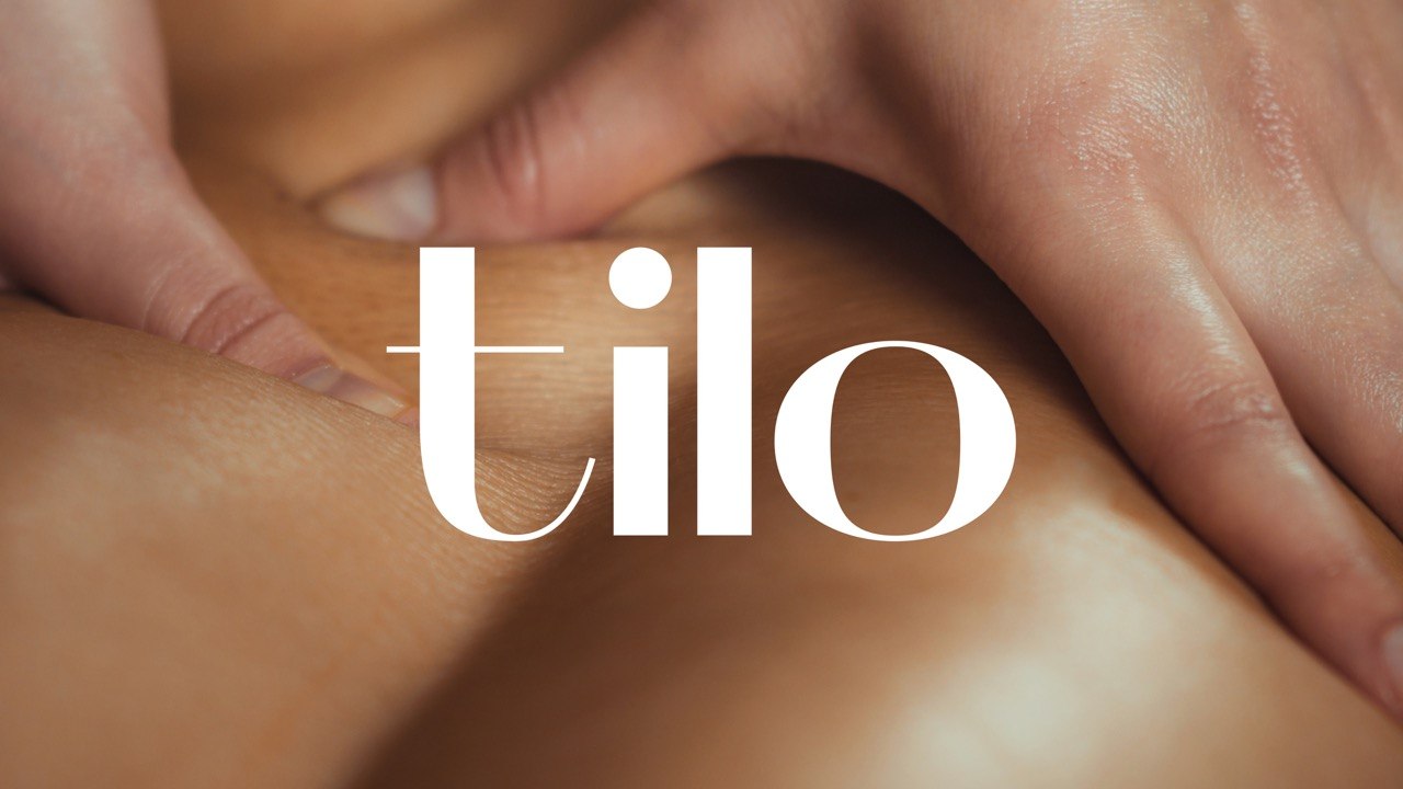
Logo
The logo is based on a typographic design. The fluid curves of the letters evoke the shape of the body and the smoothness of movements during a massage. As a result, the logo has a clean, minimalist look while effectively conveying the nature of the services.
.jpg)
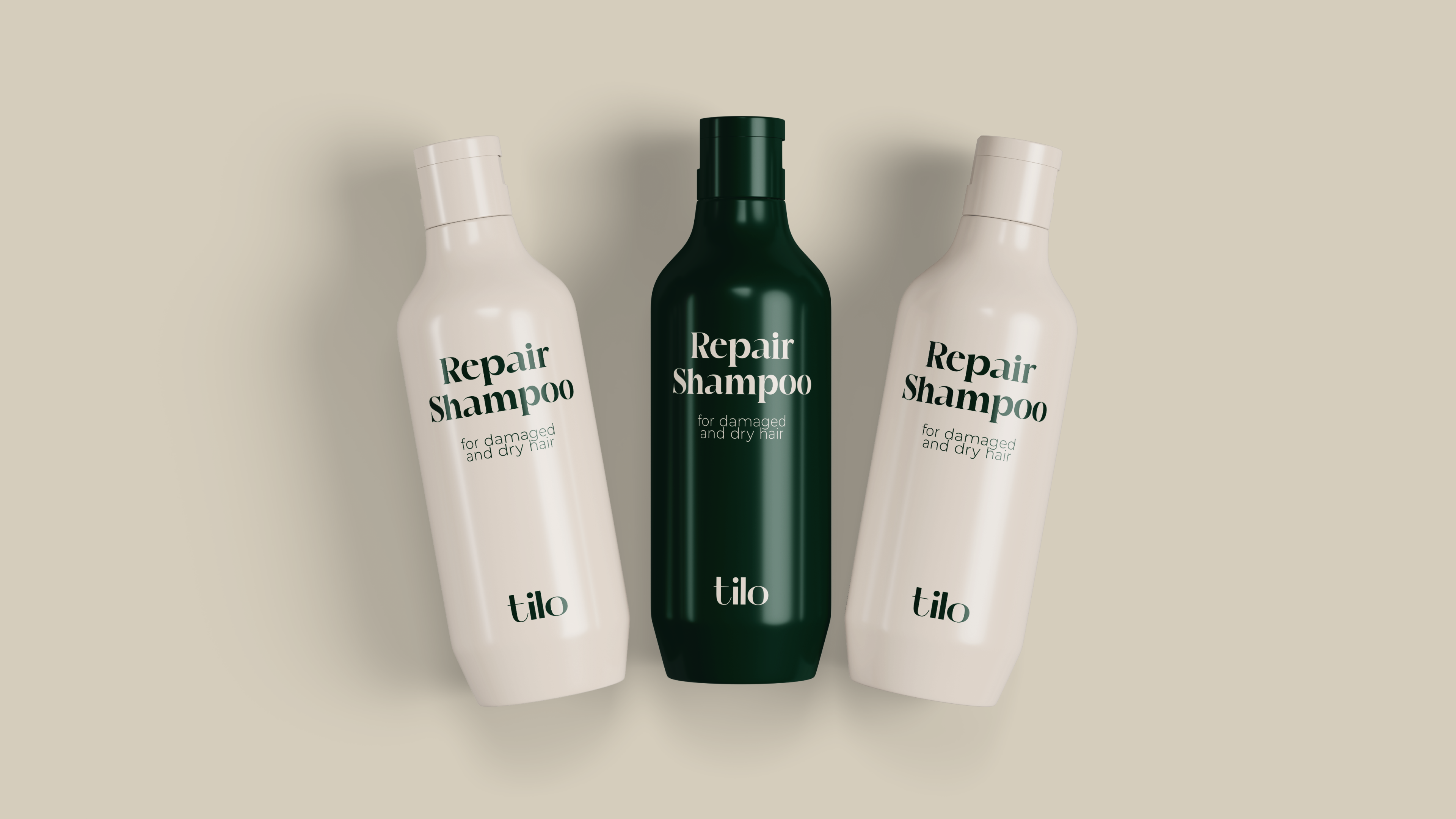
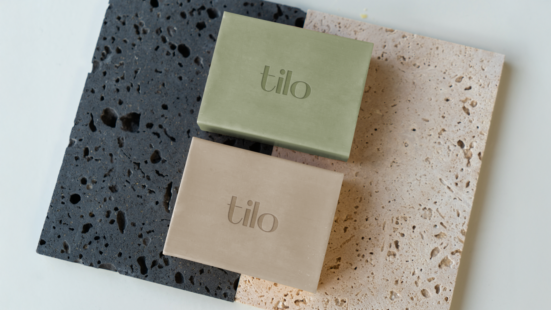
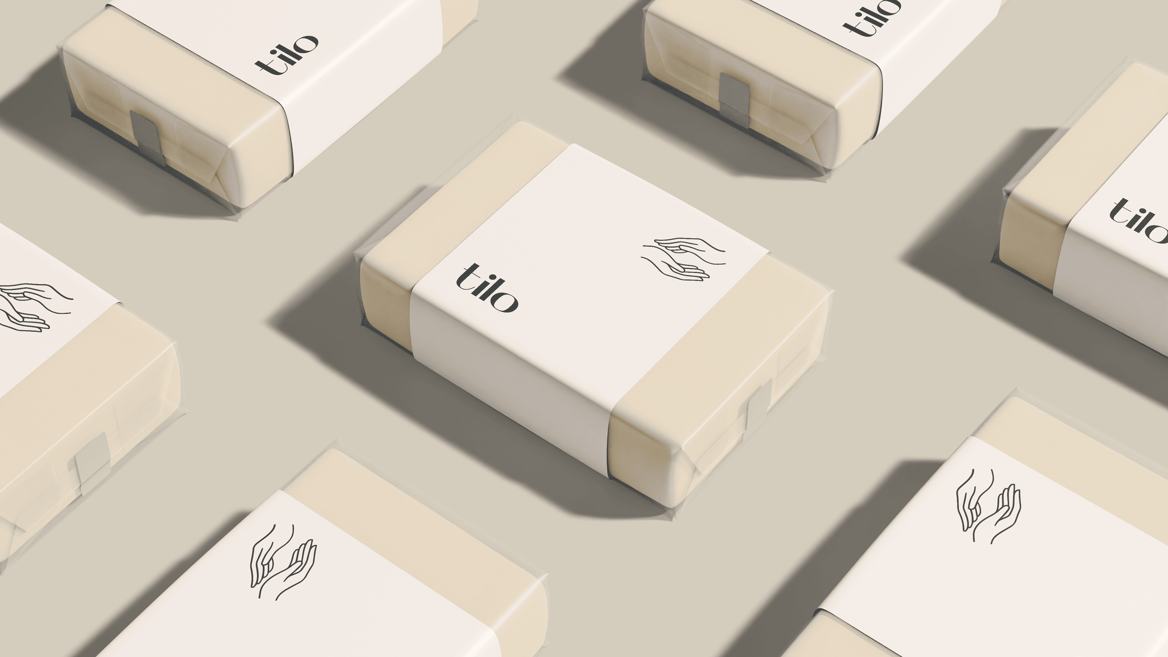
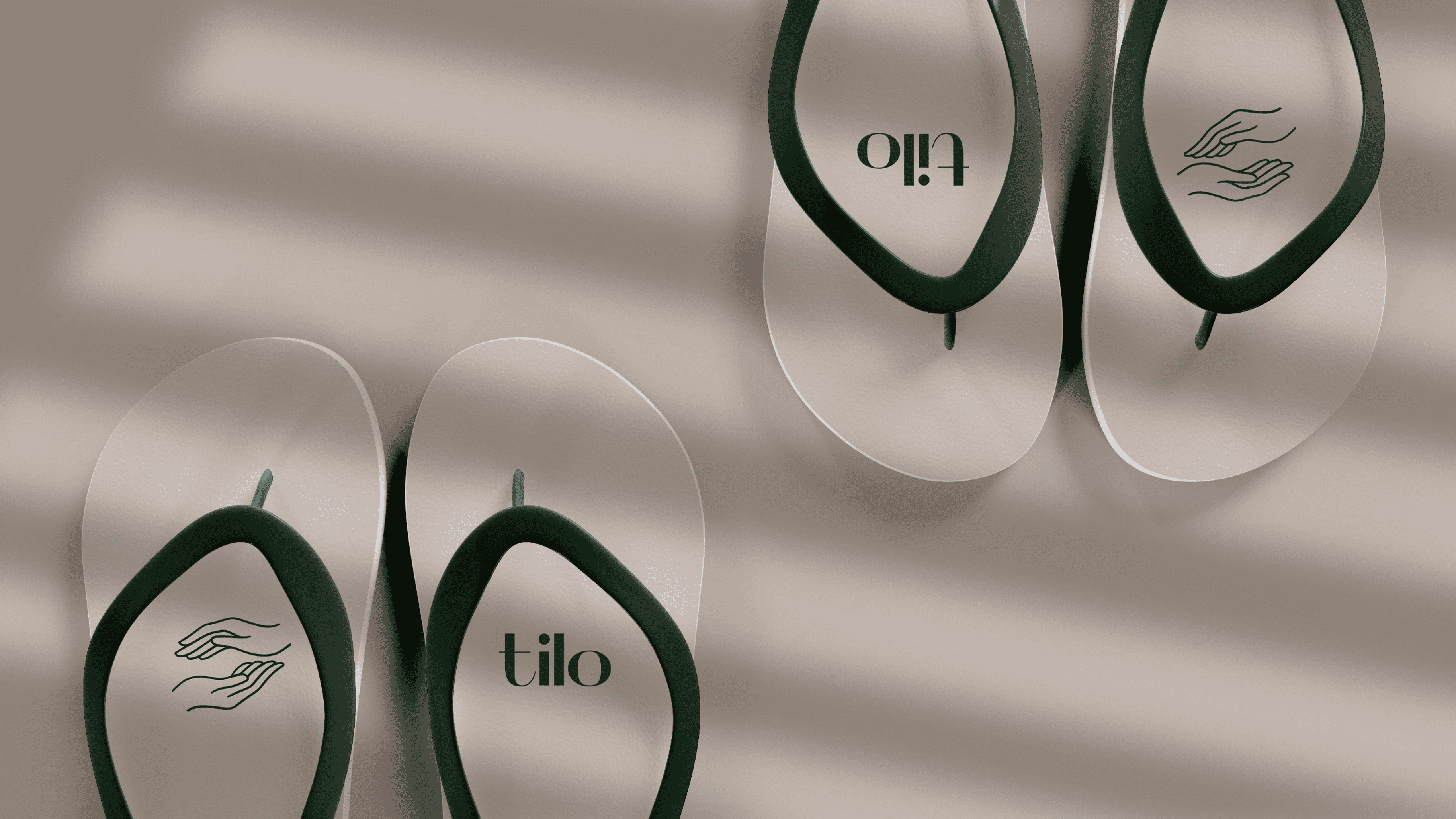
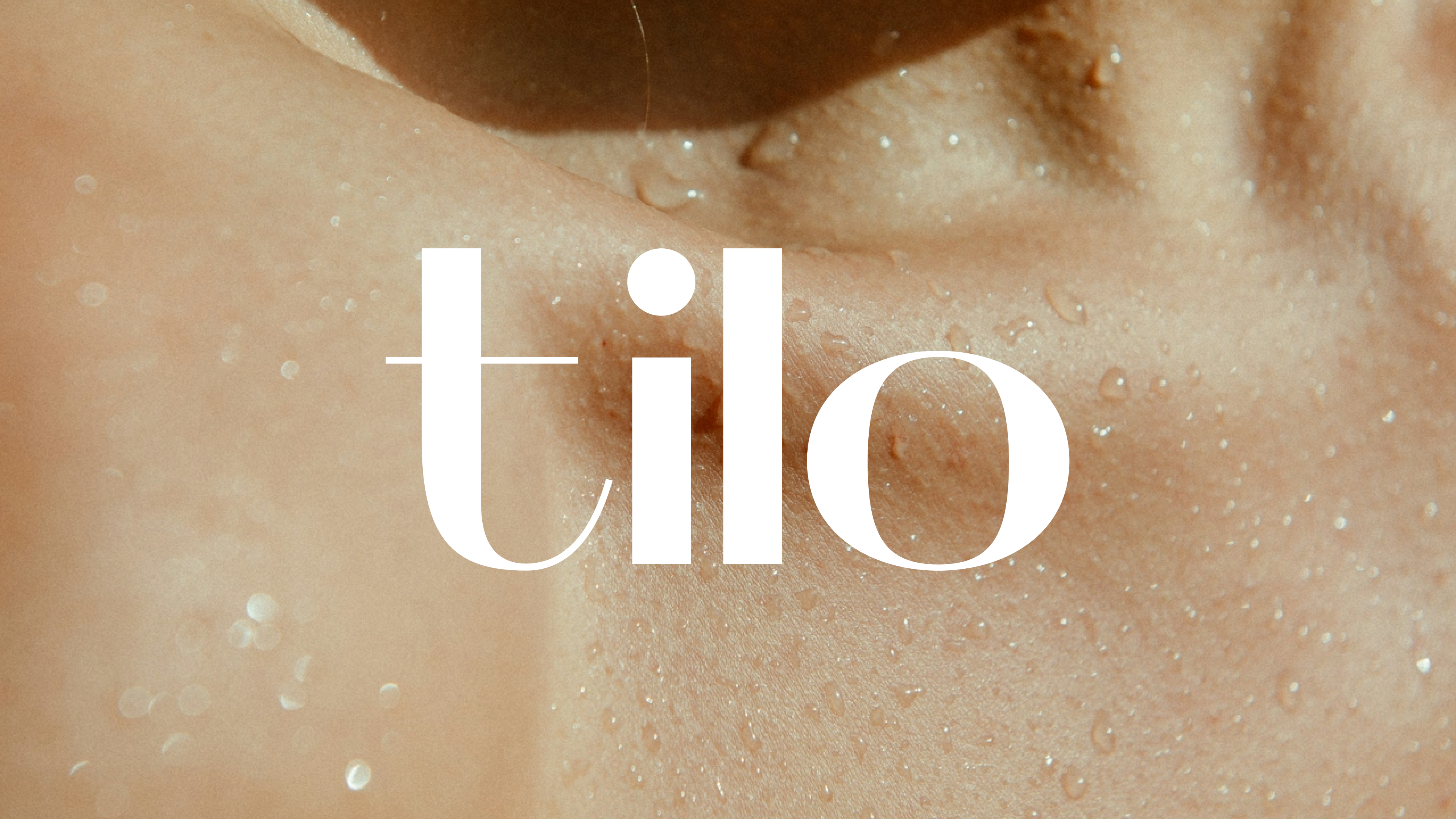
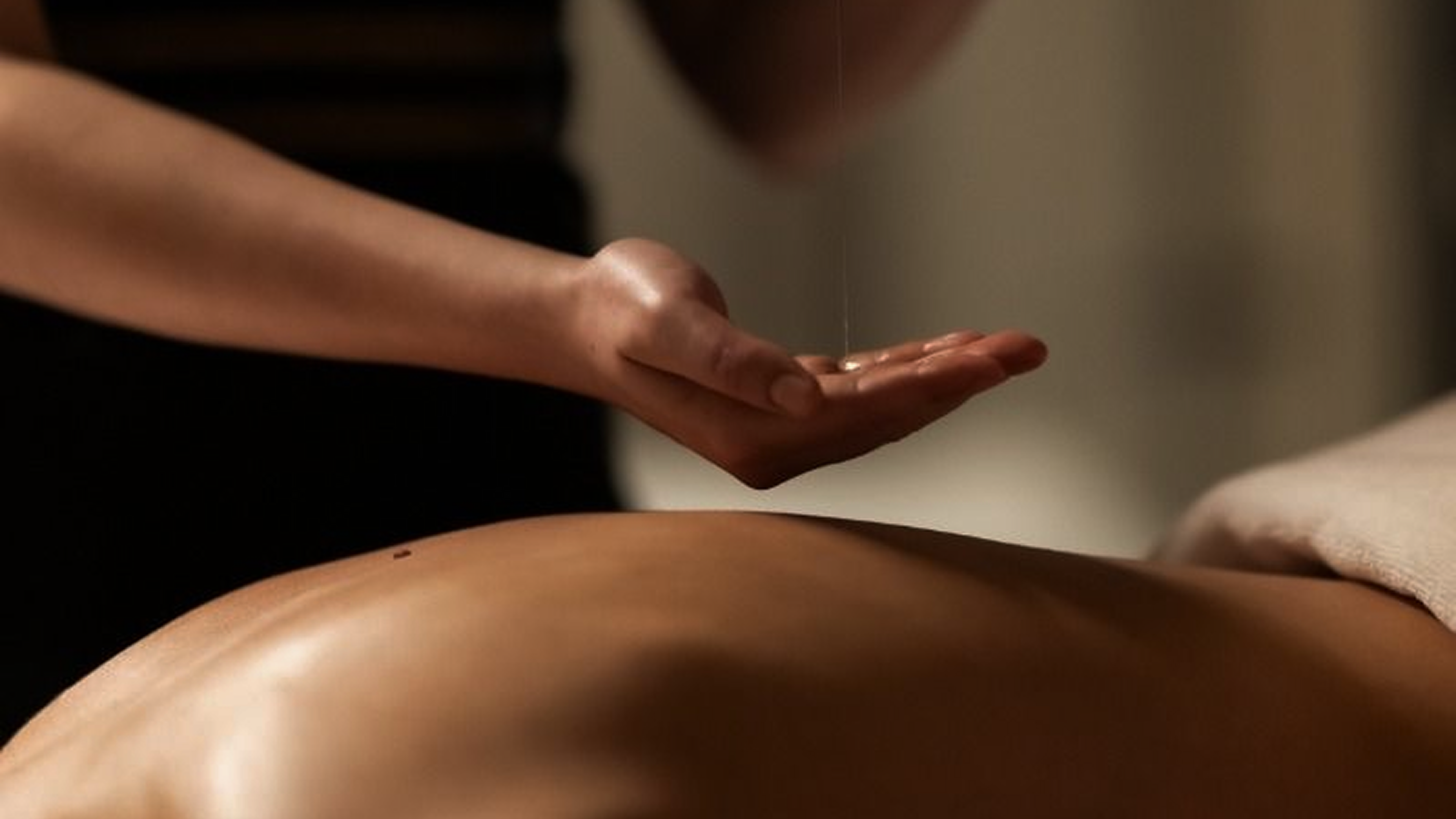
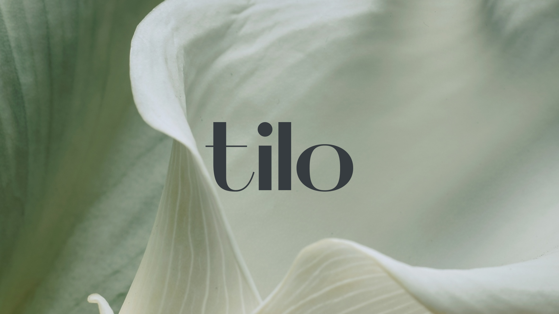
Visual Identity
The brand identity combines minimalism with a sense of warmth and tranquility. We chose a warm, natural color palette that evokes feelings of rest and relaxation. This visual style creates a sense of calm even before the visit.
((images1))
Instagram and SMM Management
After the brand launched, the client approached the g.agency team with a new task: to systematically grow the studio’s Instagram page. We developed a visual identity for social media and took on full SMM management.
The g.agency team:
- creates visuals for posts
- writes copy
- plans and publishes content
- coordinates materials with the client
- designs highlights and the page layout
Instagram has become the studio's primary channel for communicating with clients.
Result
Tilo Studio received a minimalist brand identity that accurately reflects the owner’s approach to bodywork. The brand identity helped the studio stand out among the typical massage studios in the residential complex and blended seamlessly into the building’s facade. Thanks to a systematic approach to Instagram management, the brand’s communication has become consistent and recognizable.
.png)